The Commission, Hannah Fry | Sky Portrait Artist of the Year 2025
- Dec 7, 2025
- 10 min read
Updated: Dec 28, 2025
Following winning the Sky Portrait Artist of the Year 2025, I found out that I was commissioned by the Royal Society to paint a portrait of Mathematician and broadcaster, Professor Hannah Fry! In this final saga of PAOTY, I will be going through my experience of meeting Hannah, building a connection and my process of making the commissioned portrait. I've split this last blog post into Studies/ The Sittings, Making The Portrait, and the final Hannah Fry Portrait.

In total, I had three sittings with Hannah before I had a month to complete my final portrait. The first and second were done at Hannah's home. Even though it can be quite intense for a film crew to enter your personal space, Hannah was nothing but welcoming and warm to me. She made me feel at ease, and she seemed genuinely curious about my work, which I found fun to dive into the technical (albeit slightly scientific) process of what I do! We had so many lovely chats about our personal experiences and parallels as women in STEM and the arts, our working-class backgrounds, female health... the list goes on. Our producer had to stop us from talking several times to try to save it for the camera. I also expressed my nerves about being on the show and becoming open to public criticism, and she reassured me about her experiences and ways to navigate past it. I am so grateful for our time together, and I really felt that this was such a dream pairing between sitter and artist.
Studies
Sitting Number 1

Approaching our first sitting, I wanted to connect with and learn about who Hannah is as an individual, from her achievements as a mathematician and broadcaster, her personality and her life away from cameras. It was important to me to have conversations with Hannah about how she wanted to be perceived. As a woman, I wanted to give her as much autonomy and say in her portrait, whilst incorporating my connection and marks in the process. During a visit to the Royal Society earlier in the week, I saw many portraits of scientists holding or surrounded by objects that alluded to their scientific achievements. I talked about this with Hannah, and she told me that it felt a bit kitsch, so we scrapped that idea for her portrait!
Hannah was sitting in one of her armchairs that normally lived in a cosy nook. For filming, we pulled the chair out into the middle of the room. I loved the chair for multiple reasons, and it allowed Hannah to sit comfortably to adopt a relaxed and open body language, which was important to me. For my first study, I made a charcoal drawing. We were chatting so much that I couldn't render it that far, but I managed to complete it back in my studio on the weekend. This study allowed me to think and map out composition and tones. Hannah was wearing a lovely tartan/ plaid jacket, which unfortunately, (tonally) blended with the pattern of the chair behind. She asked if there was anything I wanted her to wear for the next sitting, so for tonal balance, I asked if Hannah could wear a light-coloured top instead.
It wasn't shown in the episode, but I also created a small gouache 'sketch' - similar to what I did for my portrait of Matt. I played around a little bit with colour. Hannah's auburn hair is visually iconic to her 'look', but I was naturally drawn to use a palette consisting of oranges, reds and pinks. I felt these colours resonated with Hannah's warmth and personality, whilst also being feminine and a show of strength.
I took some photos of Hannah towards the end of the sitting to continue developing studies in my studio.
Back in the Studio...

I made two monotypes. One was a head study of Hannah. In this study, I was practising likeness and experimenting with colour. This mono was made with an etching ink blend of Carmine Red and Burnt Sienna. It printed a rich, earthy orange- it wasn't quite the tone I was looking for, so I decided to add Ruby Red to the mix next time for a more pinky hue.
For my next study with Hannah, I noted that I wanted her to be angled to the side so that I could convey a stronger sense of depth and three-dimensional form through my mark-making.
Back in the second week of April (between the heats and semis), I attended an intermediate oil painting short course at UAL - taught by the great Enver Gürsev! Back in January, I was awarded a grant from the A-N Foundation to develop monoprinting techniques. I want to push the boundaries of my medium and have been investigating how I can incorporate traditional oil painting techniques and intaglio practices into monoprinting to paint with print. I booked onto this short course months before finding out that I'd be on PAOTY. From the week, I learnt more and connected with grisaille and glazing painting techniques - I thought it had potential to elevate my monotypes and incorporate colour whilst retaining the mark-making I love. Here is the self-portrait I made from the course.

Wanting to bring this technique into Hannah's portrait as a means to elevate the work, I made a small black and white study of Hannah. Unlike normal printmaking paper, this monotype was printed onto Arches Huile paper, which has been specially developed for oil painting, ensuring it doesn't degrade over time from the glaze.

On top of this study, I applied glazes and finished it with pastel. The black monotype made the overall image feel too dense and dark - it did not reflect the warmth or energy I was looking for. From this, I decided that my monotype of Hannah should be made in the original colour palette I had envisioned, but glazing could be a way to incorporate pink and orange hues.
Sitting 2
Heading to Hannah's home a second time, I wanted to alter a few things with Hannah's positioning for our second sitting. Last time, she was quite forward-facing, which, whilst direct, felt a little awkward when displaying openness. This time, I re-positioned the chair at a 3/4 angle. I also placed it back in the corner of the room where it normally sat. At this point, I wasn't sure how much of the room/ environment would make it into the portrait. However, I wanted the lighting to feel more natural when it hit Hannah from the window (as opposed to artificial studio lights).
Hannah very kindly wore a white top for this sitting, which felt like a good call as it made the scene in front of me seem lighter and provided a pattern break from the chair. At this point, I'd thought I'd mention that the chair felt symbolic for me to include. In the Royal Society, many historic and traditional portraits featured a throne-like chair. Hannah's personal armchair was a feminine and contemporary spin on this, and the floral pattern provided aesthetic interest to the monotype. There was also a story Hannah shared with me about the chair's pattern - it became a bit of an in-joke - and while it's not my story to tell, it has become a personal feminist symbol!

For this speedy study, I decided to produce a monotype sketch, so I painted an aluminium plate to print later in the day (my studio was conveniently a 20-minute drive away from Hannah's home). As a scientist, Hannah seemed really engaged and curious about my process, and we thought it would be amazing to show her exactly how I print a monotype! So off we went to Thames-Side Print Studios in Woolwich, where I showed Hannah the etching presses I use. Together, we printed my plate. This sketchy monotype was made to check the composition and the angle of Hannah's body in the image. From this print, I was leaning towards not showing any background elements - it risked making the image messy, and I wanted to hold focus on Hannah, keeping the final portrait light and open.
Sitting 3
I wanted to try and start my "final" monotype and paint Hannah from life, like my portrait of Matt. So Hannah came to my studio for the final sitting, and I tried to set her up as if she were sitting in her home. Unfortunately, I couldn't bring her armchair with me, and I could definitely sense a change in comfort levels to my rather hard plastic chair... This sitting was for maybe 40 minutes; unfortunately, not a lot of time to get properly started, especially with all our chit-chat!
During my last sitting with Hannah, we discussed a bit about my Atalanta project, a series of work I made on my Masters that was personal to me and also symbolised female empowerment. It all got really emotional and heavy. I cried, but I think it helped strengthen our emotional bond and reinforced what this portrait meant to me, Hannah and the Royal Society. (Small note... if you would like to see more of my Atalanta series, let me know and I can send a PDF!)

After Hannah left, I painted for an additional 3 hours before deciding to wipe the plate. Exhaustion got to me, and it was affecting my mark-making, so I prioritised rest for another attempt the following day. It was all part of the process, and as an emotionally driven artist, I needed to ensure I was physically and mentally in a good place.
Making the Final Portrait
Going into this final portrait, I knew that my visual language would be very different to other portraits at the Royal Society. I wanted to create an artwork that embodied warmth and openness, reflecting how Hannah engaged the world in science, and also how she was with me. It would be of a woman with great scientific achievement, and within an industry where there were barriers to our gender, it felt important to me that this portrait held presence and embodied feminine strength.

Size: When I was at the Royal Society, I measured Jonathan Yeo's portrait of David Attenborough. Although bigger doesn't mean better, I decided that I wanted to push myself and work bigger than I have ever done before, leaning into the idea of a woman "taking up space" in a historically male-dominant industry. For my monotype, I ordered another aluminium plein air panel from Artist Surfaces, measuring 90 x 120 cm.
Colour: The main colour I chose for Hannah's final portrait was a mix of Carmine Red, Ruby Red and Burnt Sienna - this created a warm dusky red once printed. I then went back in with orange and pink glazing to add depth to the monotype. Whilst subtle, you can see the orange glazing in Hannah's hair. I finally went in with a red soft pastel to define certain features.
Details: In my reference photos of Hannah, I noticed she was wearing necklaces with initials on them. I had a feeling they were Hannah's daughters. A quick message to Hannah confirmed this, so I made sure to include them in the final portrait. Due to the mirror image of the monotype, I made sure to paint the 'E' in reverse so that the final letter would be read the correct way.
Background elements: I mentioned it earlier in the blog, but I leaned towards not including background elements, choosing to instead focus on just Hannah and the chair she was sitting in. When I was painting the plate of the final portrait, I sketched some background elements, like a globe and a terrarium, but I quickly decided that it didn't feel right, so I decided to wipe it, keeping the space behind Hannah blank, with a pinky hue from the residual hue of the ink.
Paper: My go-to printmaking paper is the Hahanemühle Etching Natural 300gsm paper. As I wanted to incorporate glazing to enhance the portrait, I was experimenting with Arches Huile paper - a paper specially designed for oil painting. Although traditional printmaking paper has been designed to withstand etching inks, glazing would sink into the paper fibres, causing it to degrade over time. Arches Huile is semi-absorbent, allowing me to soak the paper for printing, whilst allowing the glaze to sit on top of the paper whilst ensuring long-term preservation of the surface.
As I was making the largest monotype I've ever made, it took a few attempts to troubleshoot and adjust to working on a bigger scale. I had to work with larger, expressive marks and tools to paint my plate. Several attempts were made to get a feel of this, and I learnt a lot from each one, adapting my approach slightly each time, whilst retaining my visual language.
An annoying struggle I also faced was painting in the middle of summer, through the 30+ degree heat wave - Hannah and the film crew experienced first-hand the sauna my studio became. At this point, the building where I was painting and printing was having its roof replaced. I had skylights, but without windows I could open, I was literally sweating buckets. Unlike traditional painting or drawing, where you can dip in and out of painting over a long period of time, I was working in attempts. The heat wave we experienced in the UK was affecting my focus, and the zone I needed to paint for 8+ hours. On the day that my 'final' monotype was made, the temp dipped to mid-20s, still hot, but I took this day as my big moment to nail it.
All in all, I think I painted my plate six times. Only two go through to the printing stage - the last being the final portrait.
Hannah Fry's Portrait
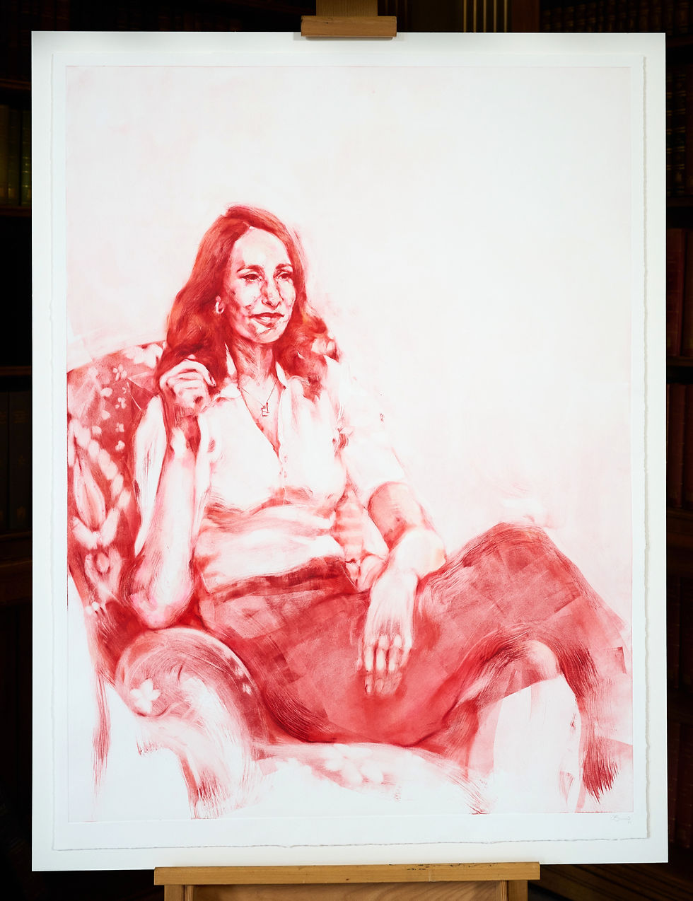
Hannah Fry, 2025
Mixed media (monotype, with glazing and soft pastel)
Unique Artwork
Image size: 120 x 90 cm
Sheet size: 126 x 94 cm
I am very grateful for the opportunity to paint Hannah's portrait and for it to be on display at the Royal Society. The portrait has now been framed and will be publicly unveiled on Tuesday, 9 December at Hannah's David Attenborough Lecture. The artwork will be open to the public to view from 15 - 19 December from 3 - 5 pm at the Royal Society, so do go have a look if you're able to.
As monoprinting is under-researched and under-documented as a medium, I also decided that I was going to gift the printed plate to the Royal Society as an artefact of the process. It felt fitting for a place of scientific achievement and innovation, and hopefully inspires many artists to give it a try in the future.
For any questions about the artwork and my process, feel free to leave questions below. And from the bottom of my heart, thank you so much for joining me on this experience.
I've made a limited edition of giclee fine art prints of Hannah's portrait, which you can buy here.
For sales enquiries and the full catalogue of available works made during the Sky Portrait Artist of the Year competition, please email contact@chloebarnesartist.com


My Perfect Hotel proves a tycoon game can be both calm and addictive.
Ragdoll Hit somehow makes flailing arms and legs the best part of gaming.
I love how Tiny fishing rewards patience — the deeper you go, the more interesting the fish get.
Every session of Level Devil starts with confidence and ends with me questioning everything 😂